
Simple Desk Setup for a Calm Home Office
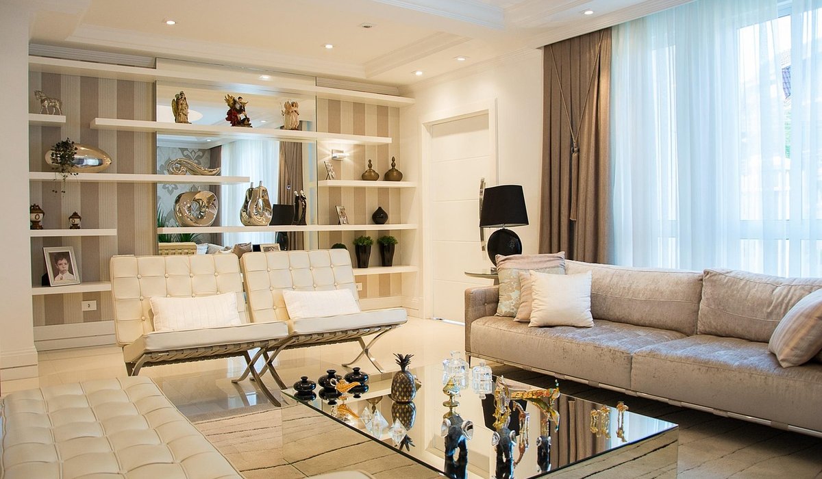
Why a Neutral Room Needs Texture
Neutral schemes are gloriously calm, but they can tip into flatness. A room with only smooth painted walls, a plain linen sofa and a matching rug gives light nothing to catch, and the whole space reads as slightly lifeless — more showroom than home. Texture is what gives a restrained palette its depth. It creates tiny shadows, alters how light falls across a surface, and makes a room feel lived in.
The trick is layering three families of surface: soft and chunky, smooth and cool, and woven and dry. Coastal-inspired living is a natural fit for this. Think of a windswept shoreline — pale sand, sun-bleached driftwood, smooth pebbles, dry marram grass. Almost the same palette, wildly different surfaces.
Begin at Floor Level
Floors cover the most square metres, so start here. If you have pale wood or stone, add a rug — or better, two. A large jute or sisal rug (around 2m x 3m under a sofa arrangement) gives you a dry, matte base layer. Then float a second rug in wool or a wool blend on top, offset slightly so the edges of both are visible. That overlap alone adds more depth than any accessory.
If you'd rather have just one rug, choose a hand-knotted wool with a looped or cut pile of at least 15mm in ivory, oatmeal or chalk. Pale colours can absolutely feel soft — it's the pile depth and the visible weave that do the work, not the shade.
Mix Soft Furnishings with Deliberate Contrast
This is where most neutral rooms stop short. A sofa needs at least three distinct textures across its cushions, not three cushions in the same fabric.
- A chunky cable-knit or boucle cushion, roughly 45cm, in undyed cream
- A smooth washed linen or cotton cushion in a cooler grey-beige, for contrast
- A sheepskin or textured wool accent, around 30cm, for softness and warmth
Stack sizes rather than lining them up: a 55cm square at the back, a 45cm in front, a small accent last. Odd numbers look more relaxed than pairs.
For throws, a chunky knit with oversized stitches (think 10mm needles) is ideal. Fold it lengthways rather than spreading it out, and drape it over one arm of the sofa or the back of a chair. A throw that's neatly arranged looks styled; one that's spread flat looks like laundry.
Bring In Woven and Natural Elements
Rattan, seagrass, water hyacinth and willow bring a dry, tactile quality that stops neutrals from feeling precious. Baskets are the easiest route in: a set of three in graduated sizes beside a fireplace, one holding a rolled wool throw, another with logs or magazines. A woven tray on an ottoman tidies a candle and a book while adding texture.
Don't overlook overhead space. Most neutral rooms are bare above eye level, so a woven pendant or a wide drum shade in rattan will add warmth and cast lovely patterned light in the evening.
Vary your weaves as you would your fabrics. A tight flat weave beside a loose chunky one looks considered; two identically woven baskets look like a matching set from a catalogue.
Smooth Ceramics and Hard Surfaces
Texture isn't only about softness. Neutral rooms need something cool and smooth to stop everything feeling fuzzy. Unglazed stoneware vases, a matte ceramic lamp base, a travertine or marble side table, a bowl of smooth pebbles collected on a walk — these give the eye somewhere to rest.
Keep them in the same tonal family (chalk, oyster, putty, soft grey) and vary the finish rather than the colour. Group three vessels on a shelf: one tall and matt, one squat and gently glazed, one with a rougher surface. Add dried stems — wheat, bunny tails or olive branches work well — and let them lean rather than stand perfectly upright.
Keep the Palette Tight and the Layers Balanced
The discipline that makes texture sing is restraint with colour. Choose three or four neutrals and stay with them: chalk white walls, oatmeal textiles, warm greige, plus one darker anchor used sparingly — a charcoal picture frame, a warm grey-brown lamp base, a single dark ceramic.
Then balance rough against smooth. If chunky knit dominates one half of the room, place ceramics or glass in the other. Aim for roughly two-thirds soft and woven to one-third hard and smooth in a living room; too much of either and the scheme flattens again.
Check your layers in lamplight as well as daylight, because texture reads completely differently after dark. A warm bulb around 2700K keeps pale textiles from turning grey, and a low, shaded lamp will pick out every stitch and weave on a knitted throw in a way ceiling light never will.
Finally, edit. Neutral rooms are rarely muddled by too many textures — they're muddled by too many things. Take one object off each surface, step back, and see what the room looks like when the layers have space to breathe.
LEAVE A COMMENT